Episodes

Sunday Oct 22, 2017
Let's Talk Type
Sunday Oct 22, 2017
Sunday Oct 22, 2017
In this episode of Memphis Type History: The Podcast, we're talking type – typography that is! Rebecca gets in the hot seat to teach us all about appreciating the visual form of words and letters... and how we can get more into typography in our everyday lives.
We dive right in to typography as it relates to signage and lettering in this episode. So we recommend that you first listen to our intro episode if you haven't already for a background on how Memphis Type History began and the double meaning in its name.
Typography is text, fonts... type is a letter form. Letter form is an art form that can be made digitally on the computer or by hand, and even through typesetting like on a letterpress where letters made out of wood or metal are used to create different prints. These days, endless type can be created, and even sold, using modern technology!
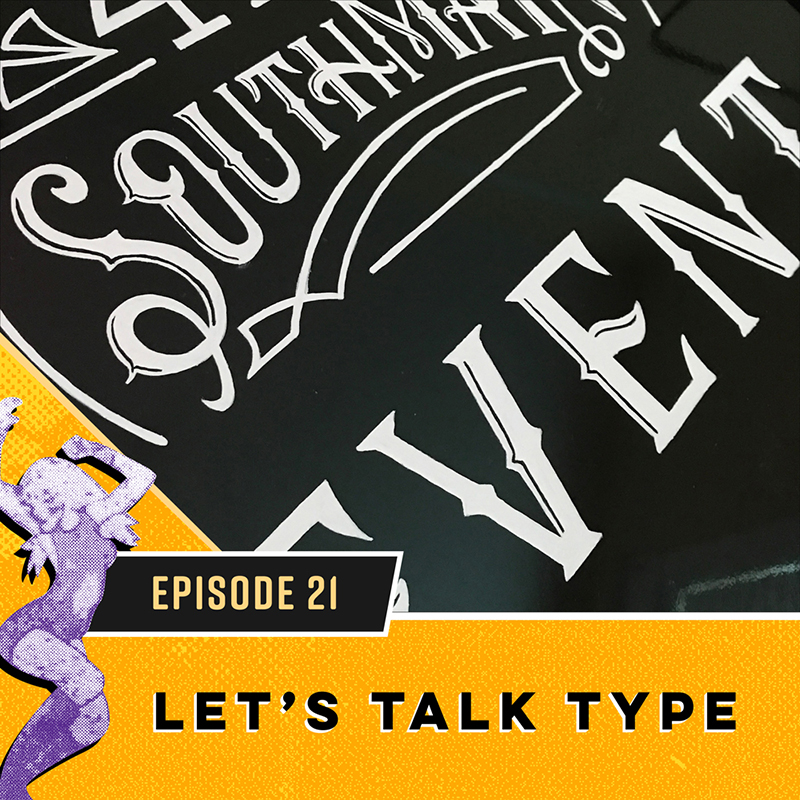
In the olden days, signs were typically hand-painted. What was painted on the side of the building to advertise what was inside often became the logo for the business... and this method continues today through Rebecca's own hand for businesses like Propcellar and 409 South Main.
What's needed to create good type? A sense of space, composition, and a steady hand for the most part. Hand-lettering involves researching an appropriate era for inspiration and figuring out how to merge these styles with what is appropriate for the project. Rebecca will often create several different options, which often creates an entirely different feel to the entire piece even if each ones is coming from the same inspiration.
To create her Florida piece, Rebecca first planned out the piece on paper. She decided how the letters should be spaced out, what style they should have, and whether they need flourishes or not... she even thinks about how thick or thin each part of the letter should be. Unlike pieces like the one below which Rebecca creates by painting layers upon layers, her typographic pieces are sketched out first.
Rebecca begins by sketching "roughs" onto paper. She keeps working and working until it's exactly how she wants. Then she transfers the sketch (usually smaller scale) onto the wood using carbon paper. Letters don't need the soft edges that a painting of a sign or a landscape needs to look realistic, so all she has to do is paint the background and then work on top of the carbon copy sketch. In order to hide the lines, Rebecca paints slightly over the edge of the carbon marks – as she pointed out, steady surgeon hands are surely needed!
If you want to get into typography, Rebecca recommends resources like Thinking with Type , Sign Painters , and take time to visit your local library.
For full show notes go to memphistypehistory.com/type


No comments yet. Be the first to say something!